Projects

2023 — now · Design Systems · Platform UX

Data Platform

Platform UX and a first design system for offshore wind and oil-and-gas operations. Part of my time at 4Subsea.

  • Problem The platform had grown product by product, with inconsistent patterns, terms, and navigation.
  • Role Sole UX practitioner, from single components to the structure of the whole platform.
  • Approach Adopted and refined the company's first design system and led a platform-level usability redesign.
  • Outcome More consistency across products, and user research shared across product teams.
Read the full case study

Context

4Subsea develops monitoring and integrity-management software for the offshore energy industry — tools used by engineers responsible for assets in demanding, high-stakes environments. I have been the sole UX practitioner on the team, which means my responsibilities cover the full scope of UX: from individual component design to the overall structure and consistency of the platform.

Challenge

The platform had grown product by product, without a unified design foundation to keep it consistent. The result was variation in interaction patterns, terminology, and navigation that created unnecessary friction for users. At the same time, the company was expanding its user base, which made addressing those inconsistencies more urgent.

Constraints

Working as a solo practitioner in an engineering-led organization means managing competing priorities. The users are experienced engineers with well-developed opinions about their tools and limited availability for formal research sessions — which meant embedding research into existing workflows rather than staging it separately.

In addition, developer resources are extremely limited, and any time they devote to design implementation means less time they can spend on core functionality. Hence, design must progress in small, spaced increments and through compromise.

What I Did

Over the course of a couple of years, I adopted and refined the company's first design system — shared components, patterns, and documentation — bringing more consistency and an updated look across products. I then led an initial platform-level usability redesign focused on fixing some of the biggest design issues with the platform; that is being followed up with a more complete overhaul, that will be squeezed into and spread across several sprints.

What I Learned

Compared to my other projects, the main learnings in this one were more on the team and organizational side than on the design one. When development resources are a severely limiting factor, UX becomes just as much a matter of communication and negotiation with your team, your stakeholders, and your leadership as it is of research and design.
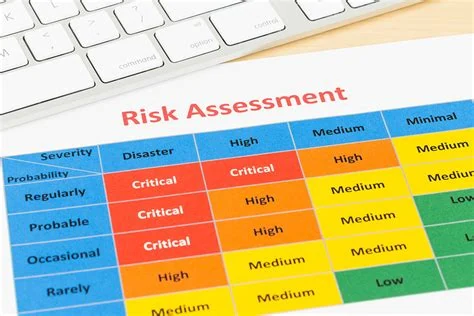
A printed risk assessment matrix, severity against probability, beside a keyboard
2022 · Data Visualization · Decision Support

National Security

Highlighting patterns in heterogeneous risk data for analysts performing work critical to national security. Part of my time at DNV.

  • Problem Risk analysts had no interface tying together large volumes of unconnected data.
  • Role UX lead and sole UX practitioner on a cross-company team: research, interaction design, and prototyping.
  • Approach Reframed the work as a proof of concept and scoped it to one incident scenario, within about 100 hours over five weeks.
  • Outcome A Figma prototype that satisfied both the client and the funding agency.
Read the full case study

Context

The client performs analyses that are critical to national security. A recent and significant increase in workload had created two related pressures: a need to increase throughput, and a need to get more value from the data already available.

My company had a set of backend tools that, combined, would support those needs. However, no user interface tied them together, and the analysts had no existing visualization or interface of any kind to build upon. So a cross-company team of developers, risk engineers, and myself had to create something new.

I was the sole UX person on the team, and my role covered the full range of UX activities on the project: all user research, interaction design, and prototyping.

Challenge

The key decision the risk analysts make is whether there is a likelihood of some security threat. Making that decision involves looking for patterns across different kinds of information existing in multiple heterogeneous sources. We had tools that could help with the synthesis of that information, theoretically enabling both better efficiency and higher informational value.

What we did not have was a window into that synthesis: a common, dynamic threat picture that would present multiple information sources and highlight connections between them that would otherwise go unnoticed.

Constraints

The client's requirements for the deliverable were specific and, in combination, demanding. The interactive prototype needed to demonstrate, credibly, that the proposed solution could reduce analysis time and improve risk detection. It also needed to look polished enough to convince the funding agency that the concept was feasible — not a rough sketch, but instead something that looked like a real product. And it needed to be able to demonstrate the solution concept within a few minutes.

The deadline left me with approximately 100 hours over the course of 5 weeks for all research, design, and prototyping work.

What I Did

The first step was to set client expectations. Their ambitions exceeded their timeline, so we worked with them to see this project as an initial step in a much larger effort — a means to form and demonstrate the concept for a solution.

The second step was tight scoping. Working with both the client and my own team, I defined a very specific scenario: a single incident, a sequence of activities the analyst would perform in response to it, and a clear endpoint. This level of specificity was essential given the time constraints. It meant I could focus my research on only those user actions, decisions, and needs that fell within that scenario. It also meant I could design only the portions of the interface that scenario would actually touch. And it meant I could add only as much interactivity as was needed to support a scripted demonstration.

For the prototype itself, I used Figma and worked from a generic design system, which allowed me to save time that would otherwise have gone to building foundational components from scratch. The actual design work is confidential and cannot be shared publicly, but the outcome of the process was a successful demonstration that satisfied both the client and the funding agency.

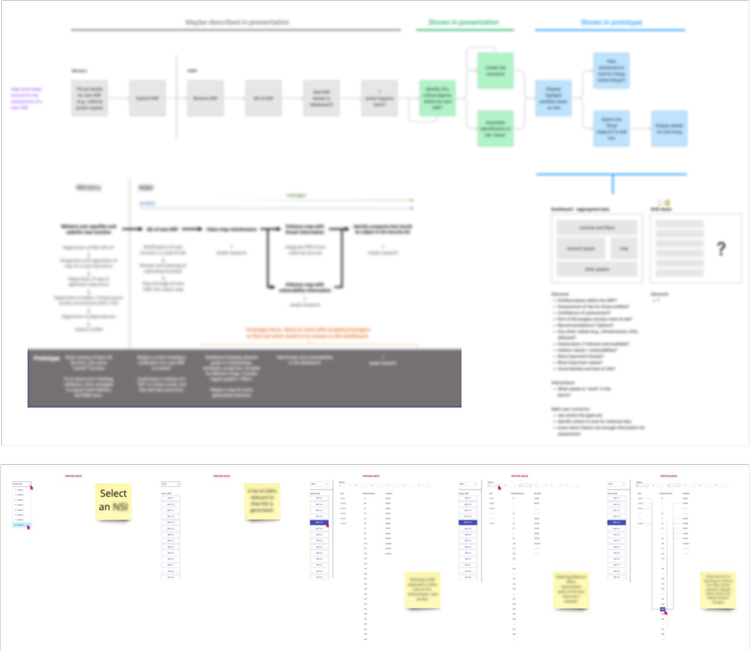
Blurred process map and prototype storyboard from the project
Some of the artifacts resulting from the user research phase. Blurred by necessity, so not extremely informative, but at least you can see some of the outlines of the user journey.
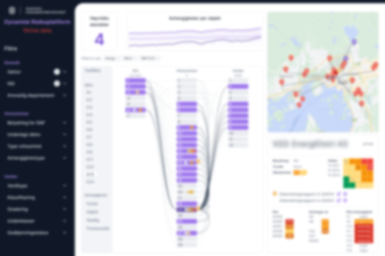
Blurred screenshot of the finished risk dashboard prototype
Sorry that the prototype is blurred by necessity, but imagine a cool, interactive UI showing relationships between disparate data.

What I Learned

This project involved the largest set of compromises I had faced up to that point in my career. Both the research and the design were far from ideal given the time available — user research was minimal, and design iteration was necessarily limited. However, the combination of early expectation management, tight scenario scoping, and a clear focus on a single use case produced something that satisfied the client.

The central lesson was one of scope: When time and money are limited, the most important thing is to define a very small, very specific target — and then hit it cleanly.

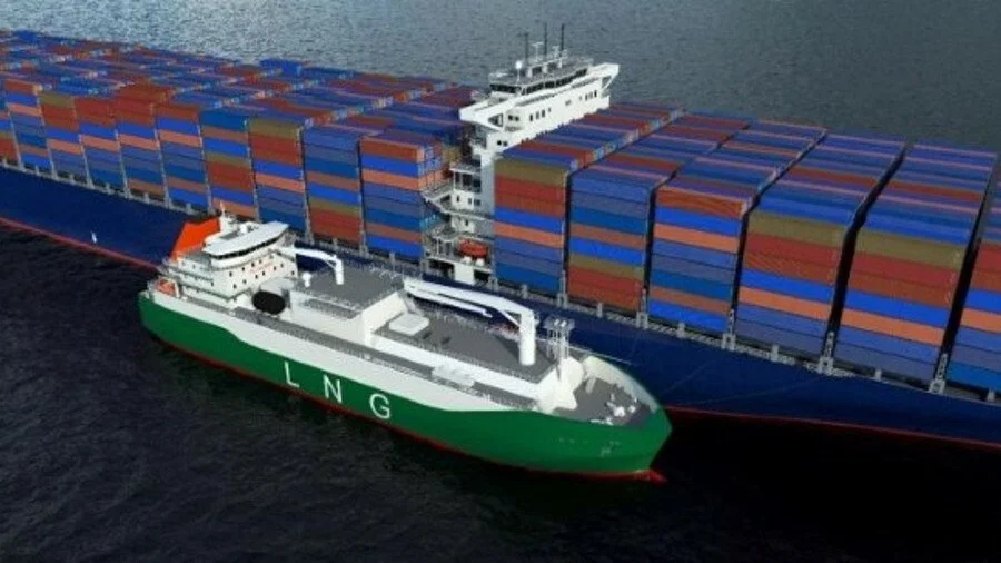
An LNG bunker vessel refuelling a container ship at sea
2020 · UX Research · Interaction Design

Maritime Refueling

Enabling better coordination for ad hoc ship refueling negotiations at sea. Part of my time at DNV.

  • Problem Ships negotiating unplanned fuel purchases at sea had no dedicated tools.
  • Role Led UX research and design, from definition to prototype testing.
  • Approach Interviews showed scheduling was the real pain, so I proposed narrowing the tool to it, then tested an interactive Axure prototype.
  • Outcome The designs became the foundation of the product that was eventually released.
Read the full case study

Context

The team behind this project wanted to build a tool that would cover the full negotiation process between companies that have fuel and ships that need it, giving the parties involved a shared environment for reaching agreement. My role was to get the project off the ground: definition, research, concept development, and prototype testing.

Challenge

Ships at sea frequently need to negotiate unplanned fuel purchases with nearby suppliers — an activity that occurs over the phone or radio with regularity but has no dedicated tooling to support it.

Constraints

The target users for this project were highly specialized and relatively few in number, and also wary of what might read as a sales pitch. Access was consequently limited to a very small number of users for roughly an hour each. That is not an ideal research situation, but it was the realistic one, and it was considerably better than the alternative of continuing to work entirely from assumptions.

What I Did

On joining the project, I worked with the team to clarify their objectives and map their existing understanding of the current activity. This included producing a diagram of the customer journey as the team understood it at that point — the steps, the actors involved, the assumed pain points. I then compiled what we needed to know and what we needed to verify, which led to a set of initial questions to take to actual users.

Rather than attempting to get a complete account of the full negotiation journey in that limited time, I focused on gaining a high-level view of the key steps and then digging into the areas that seemed most challenging or painful. The method was semi-structured interviews combined with task analysis. The research made one thing clear: Building a tool intended to support the entire negotiation process from start to finish would mean competing directly with established tools like Outlook and Excel, which did not fit the team's timeline or available resources.

The same interviews that ruled out the broader scope also pointed toward something more tractable. Scheduling — a specific part of the negotiation process involving the coordination of times and locations across multiple parties and communication channels — was a huge hassle. The back-and-forth it required, spread across a number of different channels and involving a number of different stakeholders, was identified as a point of friction.

I proposed that the team focus specifically on supporting that activity rather than attempting to cover the full negotiation process. The research provided a clear rationale for the pivot, and the team accepted it.

Multi-party remote scheduling is a dynamic, time-sensitive activity that is difficult to convey through static mockups. To communicate the concept effectively, I built a visually simple but highly interactive prototype in Axure to demonstrate the essential mechanics of how the scheduling interaction would work. The prototype was shown first to the project team and then to the users who had participated in the earlier interviews.

The response was positive. Although I moved to another project at that point, the team continued in the direction the research and prototype had established. The designs produced during this engagement served as the foundation for the product that was eventually released.

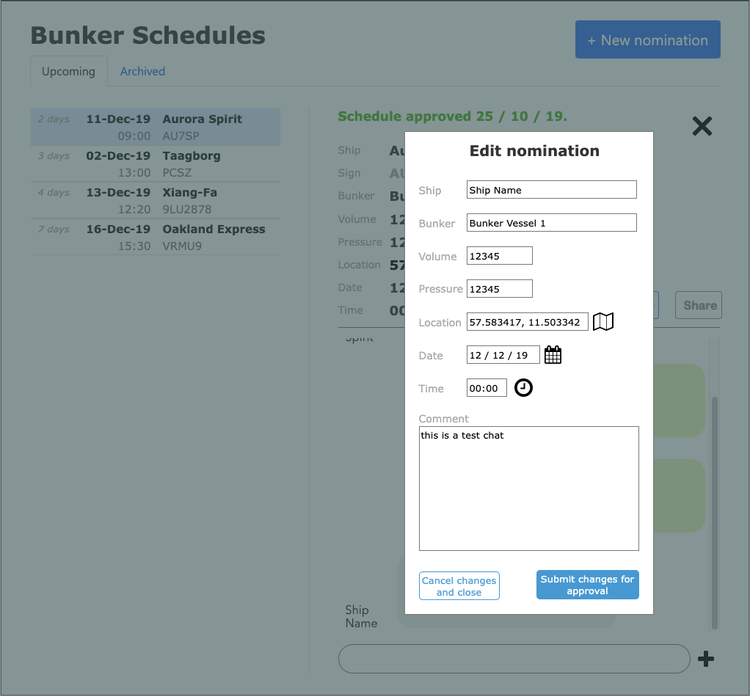
Bunker Schedules prototype: a list of upcoming refuelling nominations with an Edit nomination dialog
An early interactive prototype built in Axure for user tests.
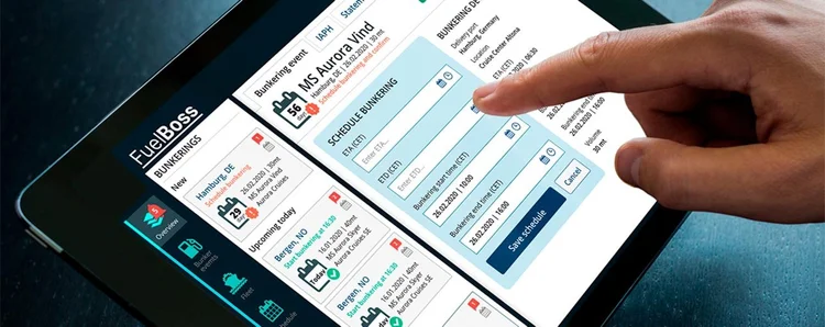
The released FuelBoss app on a tablet, scheduling a bunkering event
A glimpse of the resulting design, showing the core of my prototypes and what was learned during testing.

What I Learned

The most significant constraint throughout this project was user access. With such a small sample of participants, the findings could not be validated as thoroughly as would be ideal. Decisions made on the basis of that research therefore carried a degree of risk — which is a real limitation, but also a characteristic of early-stage innovation work, where waiting for a larger or more representative sample is often not a realistic option.

In this case, the risk proved acceptable. The direction the research pointed toward turned out to be viable, and the product that emerged from it was released. The central lesson is that limited user access does not eliminate the value of research. It simply requires being more deliberate about where to focus time and attention.

Roasted coffee beans in a burlap sack
2019 · User Research · Service Design

Coffee Ecosystem

Mapping the field-to-cup coffee journey to identify opportunities for a new digital service. Part of my time at Yara International.

  • Problem A planned matchmaking service for small coffee farms had no clear place in the coffee ecosystem.
  • Role Led the research, mapping the field-to-cup journey and the actors along it.
  • Approach Two rounds of interviews and task analysis: first coffee buyers, then roasters once buyers proved well served.
  • Outcome An ecosystem map and several opportunities among roasters, which fed the team's ideation.
Read the full case study

Context

A team at Yara had in mind a matchmaking service designed to support small coffee farms, connecting producers with buyers in a more direct and transparent way. My role was to lead the research effort: to map the field-to-cup journey, understand the actors involved, and determine where the team's concept might actually find a foothold.

Challenge

The opportunity space was not well defined, and the team was operating largely on assumptions about where in the coffee ecosystem a viable product might fit.

Constraints

The target users for this project, coffee buyers and roasters, were relatively accessible and generous with their time compared to many of the specialized professional communities I have worked with. The subject matter itself presented a different kind of challenge: The journey of a coffee bean from field to cup is genuinely complex, involving a large number of actors, geographies, and commercial relationships, each with its own logic. Mapping and making sense of that system was a satisfying research challenge — and one that was still well-contained enough to yield a coherent picture within a reasonable timeframe.

What I Did

The first step was to work with the team to clarify their objectives, align on what they hoped to learn, and surface the knowledge they already had. This involved documenting their understanding of the field-to-cup journey, their existing assumptions about actors and pain points, and the gaps in their information. The process also identified which actors in the coffee ecosystem the team had in mind as potential users. Based on access considerations, we decided to approach coffee buyers first. That decision shaped the initial set of research questions.

Through a combination of company sales contacts and my own networking, I identified and interviewed a number of people responsible for purchasing decisions at local coffee buyers. The method was semi-structured interviews combined with task analysis. The interviews produced a detailed picture of the field-to-cup journey and the actors involved at each stage, the pain points distributed across it, the key purchasing decisions buyers faced and the variables that shaped those decisions, and some early feedback on the feasibility of the team's concept.

The findings from this first round, however, did not reveal the kinds of clear opportunities for supporting coffee buyers that the team had hoped to find. The buyers had existing tools and processes that served their needs adequately, and the space for a new matchmaking service was not as open as the team had assumed.

While the first round of research did not confirm the team's original direction, it pointed clearly toward a different actor in the ecosystem: coffee roasters. The interviews with buyers had surfaced enough information about the roaster side of the relationship to suggest that the purchasing dynamics there might be more receptive to the kind of support the team had envisioned.

I conducted a second round of interviews focused specifically on purchasing activity within local roasters. This round identified a number of potential areas that might benefit from the kind of matchmaking and transparency the team had in mind. The team then entered an ideation phase, using the research findings as the foundation for generating and evaluating product concepts.

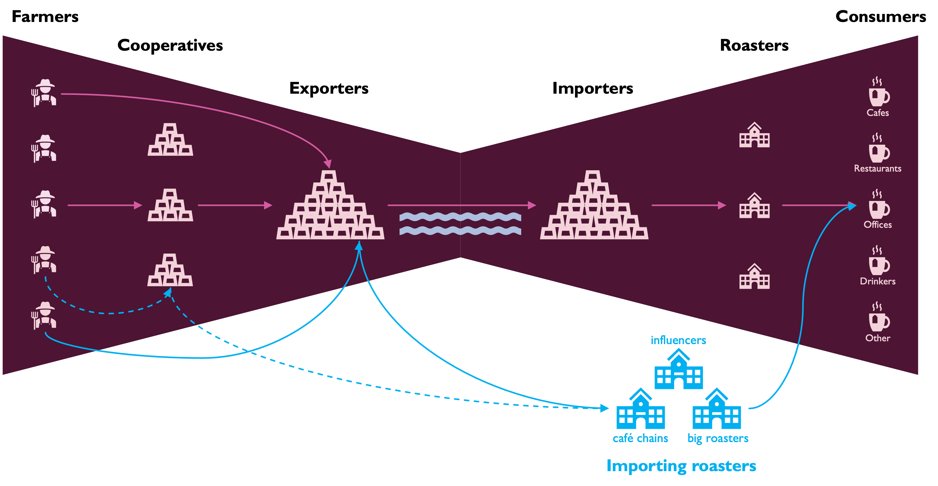
Ecosystem map of the field-to-cup journey: farmers, cooperatives, exporters, importers, roasters, and consumers, with importing roasters, café chains, and big roasters shown buying directly
An overview of the players in the ecosystem.
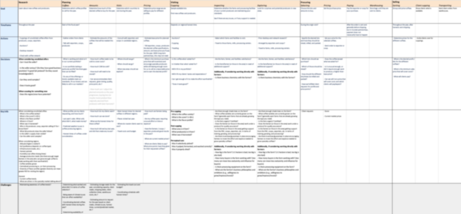
Blurred table of the roasters’ purchasing journey, from research and planning to selling
The buying journey for coffee roasters. Sorry for the necessary blurring.

What I Learned

This was one of the more enjoyable projects I have worked on, both for the richness of the domain and for the way the research process itself unfolded, with one round of findings redirecting the effort toward a more promising area.

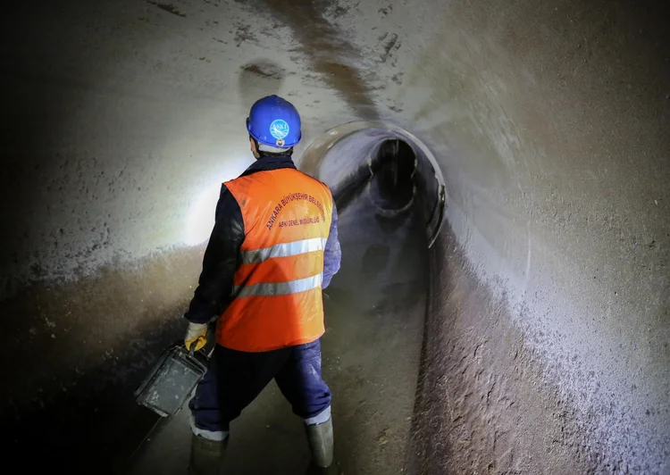
A sewer worker in a hard hat and high-visibility vest walking through a corroded concrete tunnel
2017 · Interaction Design · Data Visualization

Sewer Corrosion

Redesigning a corrosion estimation tool to support better decision-making by sewer maintenance managers. Part of my time at Yara International.

  • Problem An Excel tool for estimating sewer corrosion needed heavy input and gave results even experts found hard to read.
  • Role Redesigned it as an application for mobile and desktop, in Sketch.
  • Approach Data entry in small steps, selection controls instead of typing, and a clear view of current state, remaining life, options, and deadlines.
  • Outcome Iterated designs at mobile and desktop sizes, with the company's style guide rebuilt for the web.
Read the full case study

Context

The topic was sewer corrosion: the slow degradation of pipe infrastructure that, if left unaddressed, eventually leads to ruptures and the significant costs they bring. The goal was to help the people responsible for managing sewer systems understand the current state of their infrastructure, what their options were for addressing it, and how those options compared to one another. The strategy was an application that would simplify data entry and present the results in a way that would be understandable to non-expert users, not only the engineers who understood the underlying models but also the managers and decision-makers who needed to act on the outputs.

Sewers corrode over time and eventually fail. The people responsible for managing them need to make a set of interconnected decisions: how severe is the current corrosion, whether the present moment is a good time to invest in repairs, whether pipe replacement might be a better long-term investment than repair, and how long they can realistically delay a decision without incurring greater costs later. The company also wanted to surface a fifth option, the use of its own chemical treatments to extend pipe lifespan, as part of the comparison.

Challenge

An existing Excel-based tool covered all of the above, but it required a substantial amount of user input and produced results that were difficult to interpret even for subject-matter experts. The goal was to redesign it as an actual application — one that would be both more efficient to use and more legible to a wider range of users.

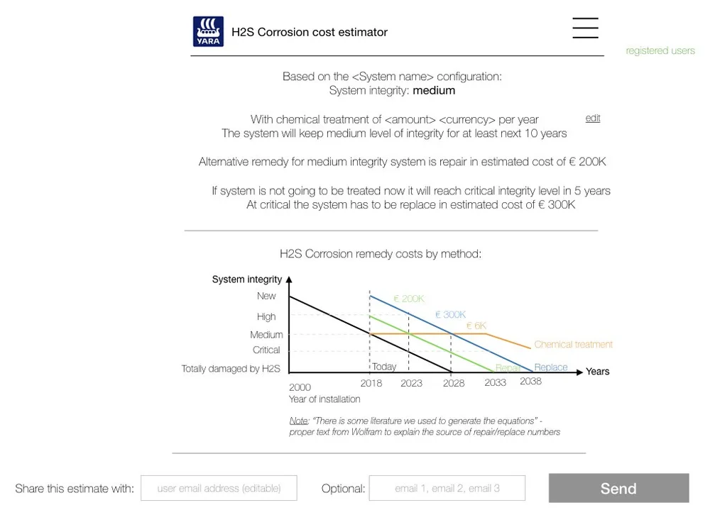
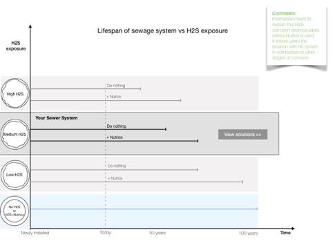
Early H2S corrosion cost estimator: system integrity, remedy costs, and a chart of integrity over time for chemical treatment, repair, and replacement Early concept chart of sewer system lifespan against H2S exposure, with and without treatment
What the team was working with before I arrived. The sketches were much too confusing for users to easily understand.

Constraints

Some degree of data entry was unavoidable. The underlying estimates required information from the user, and there was no way around that. The challenge was to make that entry as efficient and as low-friction as possible. Equally important was making the outputs of those estimates comprehensible to users who did not have deep familiarity with the domain models behind them.

What I Did

I focused on a set of design strategies to address both concerns:

  • Chunking the data entry process into smaller, more clearly bounded steps, rather than presenting it as a single undifferentiated form.
  • Using selection interfaces (dropdowns, sliders, and option groups) wherever possible rather than requiring users to type in values, which reduced input error and cognitive load simultaneously.
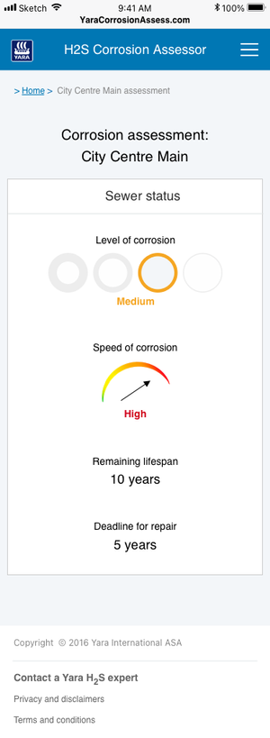
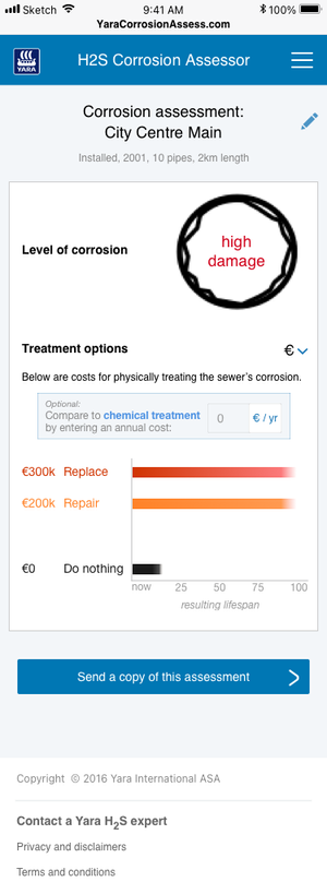
  • Supporting situation awareness by making four things clearly visible: the current state of the system (corrosion level and rate of change), the future state (estimated remaining system life), the available options (costs and lifespan implications of replacing, repairing, or applying chemical treatment), and the time constraints on the decision.

The designs were produced in Sketch and went through a number of iterations before reaching a final state. The final deliverable covered both mobile and desktop breakpoints, as the company had a preference for optimizing the experience for mobile use, reflecting where and how the target users would most often be accessing the tool.

The project also required applying the company's existing branding and style guide, which I rebuilt in Sketch and adapted as needed for the conventions of a web application context, where the original guide had not been designed with that environment in mind.

Mobile design: corrosion assessment showing level and speed of corrosion, remaining lifespan, and deadline for repair Mobile design: treatment options comparing the cost and resulting lifespan of replacing, repairing, or doing nothing
Sketch designs for the mobile app, providing a cleaner and more intuitive visualization of the key concepts that users needed to understand.

What I Learned

Looking back at this project, there are a number of design decisions I would approach differently today. The desktop version in particular has a wizard-style look and feel that steps the user through a linear sequence of inputs, which I now find somewhat limiting as a design pattern for this kind of tool. It works, but it constrains the user's ability to move freely between sections or revisit earlier inputs in response to later ones. The data visualizations, also, could be more refined and more precisely calibrated to the information the user needs to act on.

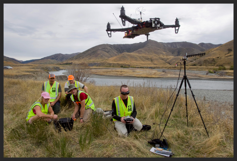
A field team in high-visibility vests flying a drone beside a river valley
2015 · Decision Support · Human Factors

Search and Rescue

Designing a drone command interface to give search-and-rescue field commanders direct situational awareness. Part of my time at SINTEF ICT.

  • Problem Search-and-rescue commanders could not see where drones were or what they recorded; it reached them by radio.
  • Role Led UX and UI design: needs, requirements, human factors, wireframes, and evaluation.
  • Approach A multi-year user-centred process: domain analysis and workshops, then design iterations tested with users.
  • Outcome Working prototypes built with front-end developers, across about a dozen European partners.
Read the full case study

Context

This was part of a multi-company, multiyear research project for the EU that focused on tools for improving drone use in search and rescue (SAR) during crisis situations. Drones are increasingly used in SAR operations, providing aerial coverage, thermal imaging, and real-time video that can make the difference in locating a missing person.

In practice, though, their use can be haphazard, because (at the time) field commanders directing SAR efforts had no direct view of where the drones were operating or what they were recording. That information reached them indirectly, via radio from drone operators positioned elsewhere on the scene. The result is a significant gap in situational awareness at precisely the level where overall coordination decisions are being made.

My company (SINTEF) was part of the consortium building this solution, and I led the design of the command console for it. My responsibilities covered needs identification, requirements generation, human-factors considerations, wireframing, and evaluation. End users were involved throughout the project, contributing through interviews, workshops, participatory design sessions, and usability tests.

Challenge

Our goal was to provide first responders in search-and-rescue operations with a system through which they could locate the drones operating on scene, direct their movements, and monitor their feeds. We wanted to give field commanders a direct, real-time picture of the aerial assets under their coordination rather than a secondhand account of what those assets were observing.

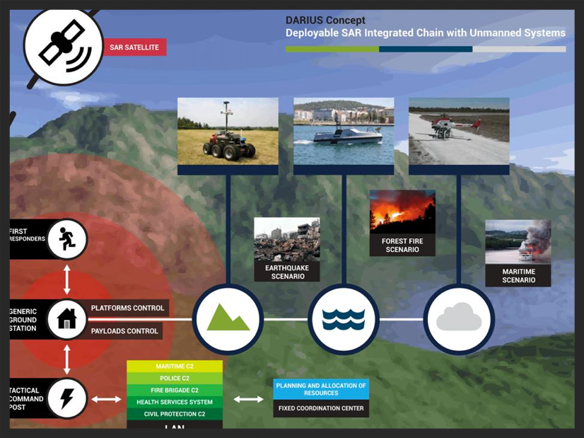
DARIUS concept diagram: a deployable search-and-rescue chain linking first responders, ground station, and command post to unmanned ground, sea, and air vehicles
An overview of the project in question.

Constraints

The project team included approximately a dozen partner organizations — a mix of academic institutions, corporate partners, small and medium-sized enterprises, and research groups distributed across Europe. The coordination challenges that come with that kind of distributed, multi-stakeholder structure were considerable.

A separate challenge was the nature of the domain itself. Search-and-rescue events occur infrequently and unpredictably, which made it difficult to observe them in realistic conditions or to test design solutions in the field. The team had to be both strategic and opportunistic — building research plans that could adapt to whatever opportunities arose, while also looking ahead to scheduled events, such as product demonstrations and first-responder training exercises, that would provide access to real users in relevant contexts.

What I Did

The project followed a user-centered design process structured across multiple years and divided into two broad stages: research and iterative design.

The research stage began with a domain analysis. This involved reviewing previous projects and published research in the area, studying existing systems used in similar contexts, talking with field experts, and conducting a workshop with search-and-rescue stakeholders. A SAR operations manual served as a primary reference, and I used it to build a map of the interactions between different roles in a typical SAR operation — how information flowed between them, what decisions each role was responsible for, and where breakdowns in coordination tended to occur. The output of this stage was a set of user requirements for the system interface.

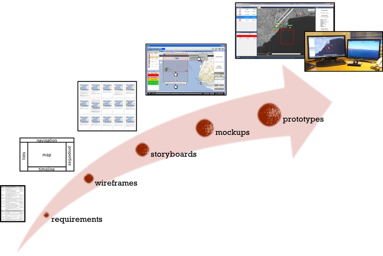
The design stage proceeded over a number of iterations, each separated by workshops and evaluation sessions with users. The deliverables included usage scenarios developed to focus and constrain the design effort, as well as wireframes, mockups, storyboards, paper prototypes, and working prototypes built by front-end developers on the team.

The design process as a rising arrow: requirements, wireframes, storyboards, mockups, and prototypes
The evolution of the designs.

What I Learned

Early in the project, my team discovered that the implementation being developed by the technical partners had diverged in a number of ways from the UX designs, which required additional effort to diagnose and correct. This served as a clear illustration of the importance of establishing explicit communication channels between design and development in any distributed project team — not as a formality, but as an active and ongoing practice.